
Conversation Water
Grand Pré
2026
Art Direction
Brand Refinement
Packaging Design
Print Design
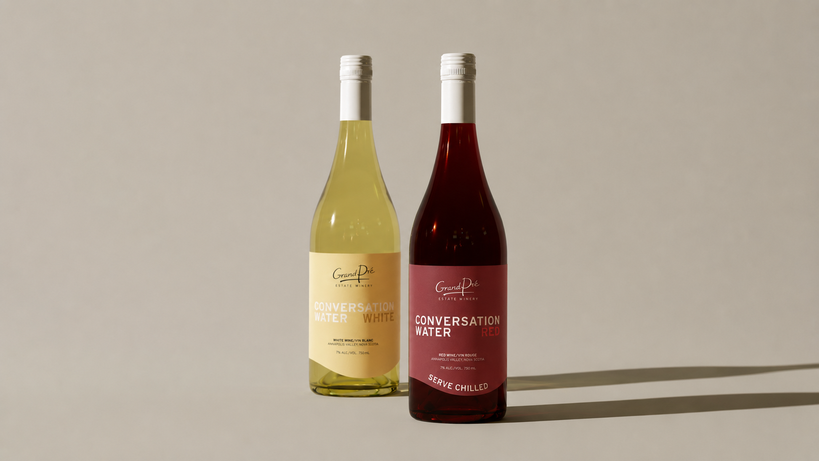
Grand Pré Wines was adding a red to their Conversation Water line, an existing product with a name, palette, and wave motif customers already recognized.
The goal wasn't to reinvent the label, but to refine it: introduce the new variant while keeping the equity already built into the line, and address legibility issues that made it harder to scan at a glance.
We kept what was working: the palette, the wave, the name. What changed was hierarchy: a cohesive wordmark, an easy-to-scan variant flag, and a more grounded, polished finish overall.
Impact:
+ Improved Legibility: Faster to scan and clearer at a distance, both on shelf and at a glance
+ Preserved Brand Equity: Retains the recognition already built into the Conversation Water line
+ Scalable System: Sets up a clearer hierarchy for future variants added to the line
The Conversation Water Red redesign shows how refinement, not reinvention, can be the stronger move: a label that still feels familiar, but reads better where it counts.
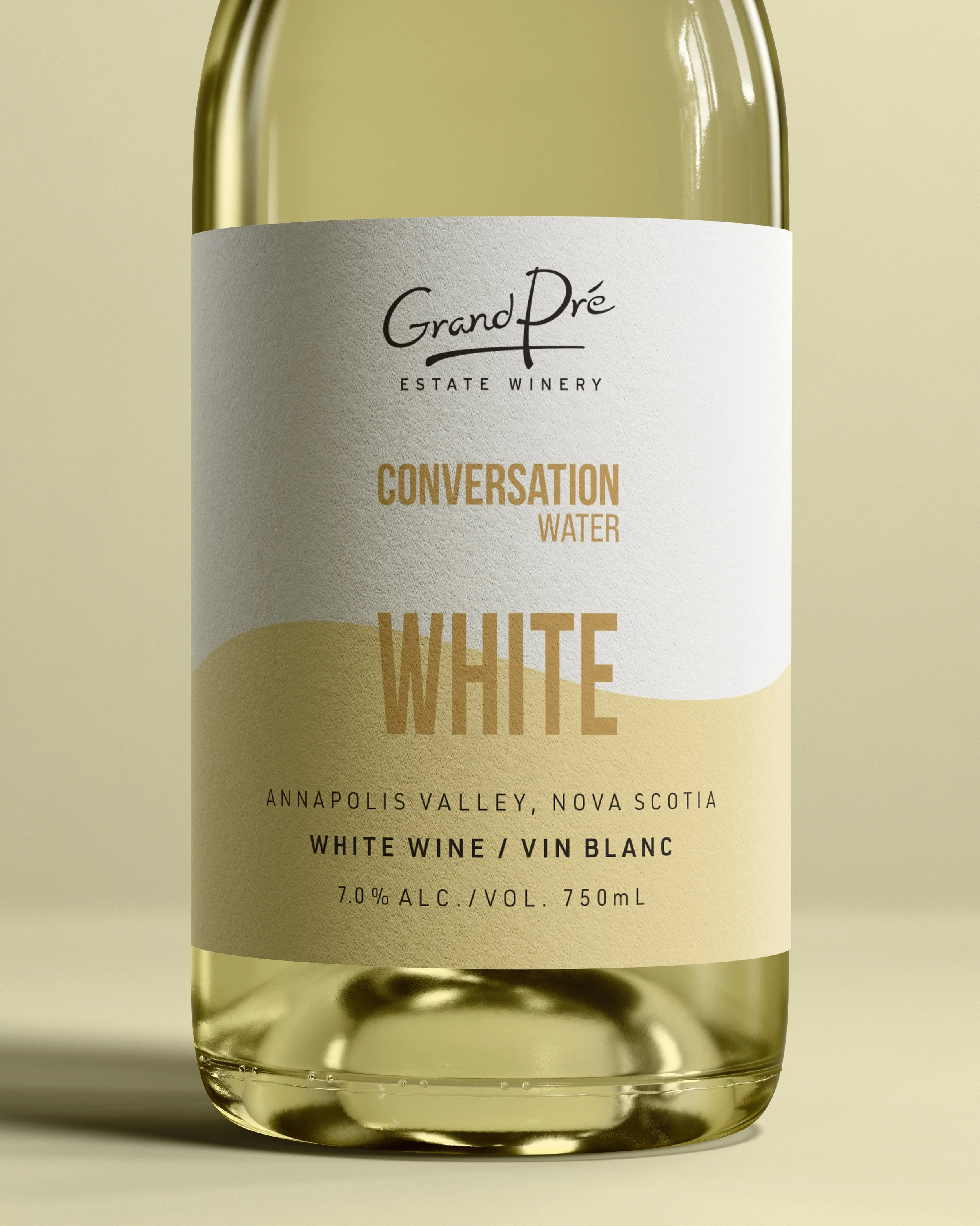
Before
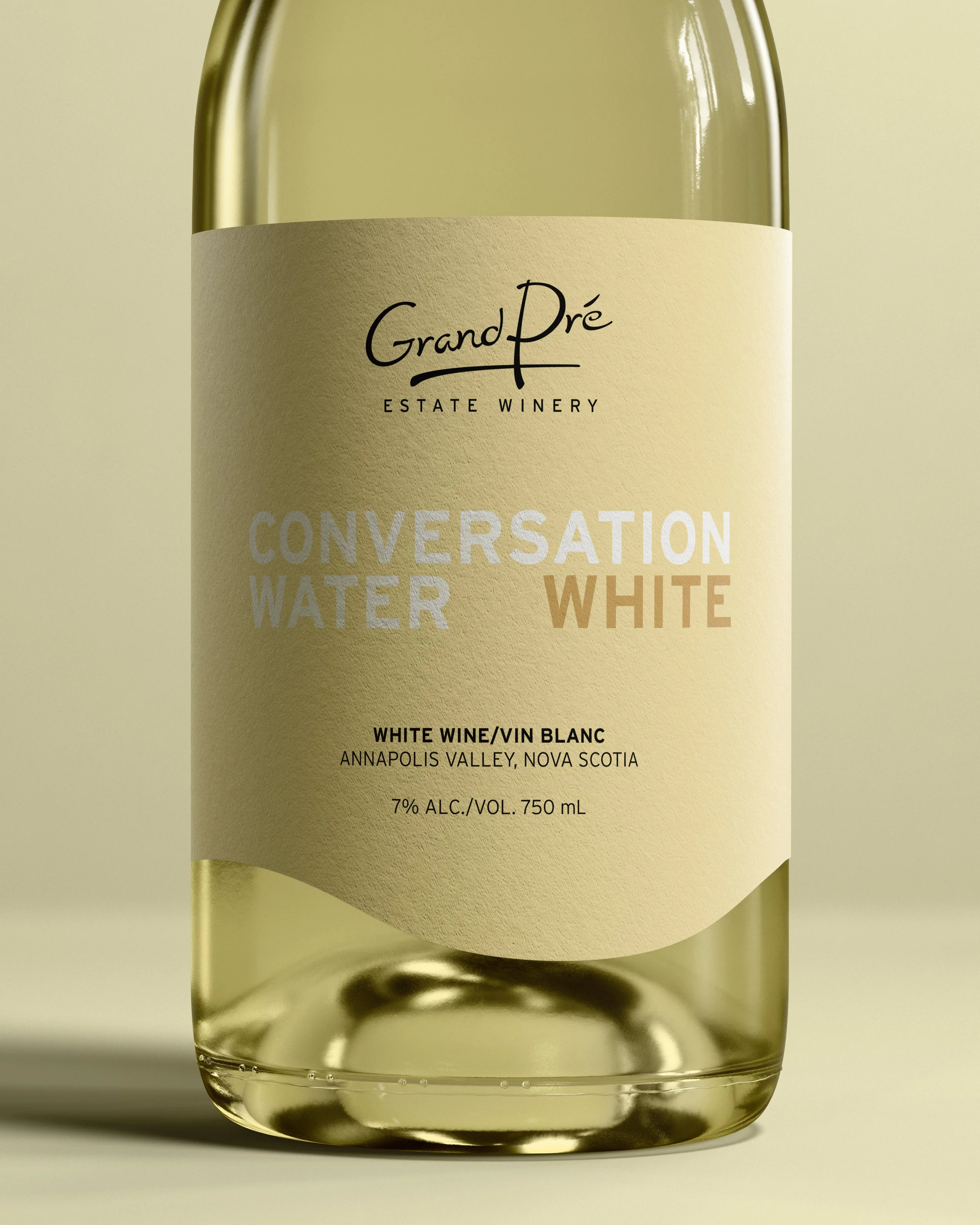
After