Alma
Toronto
2022
In collaboration with Design Agency
Art Direction
Branding
Copy Writing
Creative Strategy
Naming
Photography Direction
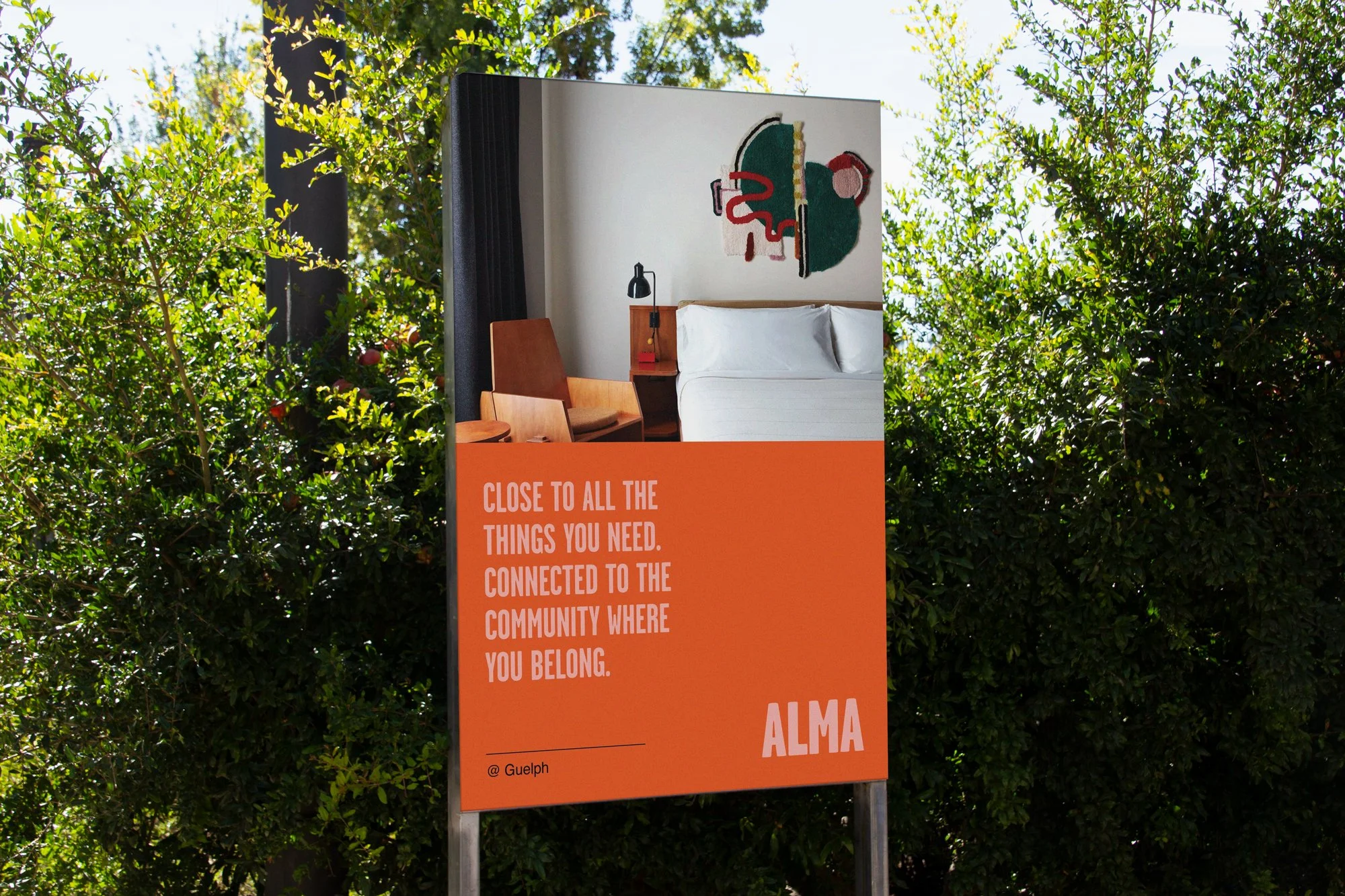
Led the brand development for Alma, a student living concept designed to challenge the conventional, institutional approach to student housing.
In a category often dominated by generic, utility-driven branding, the opportunity was to create a differentiated and emotionally resonant identity—one that appeals to students seeking community, self-expression, and lifestyle-driven experiences.
Rooted in a reinterpretation of “Alma Mater,” the brand reflects belonging, personal growth, and identity, forming the foundation for its positioning. The visual and verbal identity breaks category norms with vibrant color, bold graphic language, and a confident tone of voice, delivering a contemporary and engaging brand experience.
Impact:
+ Lifestyle Positioning: Reframes student living as an experience, not just accommodation
+ Emotional Connection: Strengthens engagement with a younger, design-conscious audience
+ Distinctive Presence: Stands apart in a saturated market often defined by bland, institutional brands
The result is a scalable, distinctive brand that elevates student housing, drives engagement, and positions Alma as a modern, lifestyle-focused choice.
The room photography used in this case study is for art direction only - they are not our own.